PCA and 3D PCA
A principal component analysis (PCA), is a way to take a large amount of data and plot it on two or three axes. It does this without knowing which groups the data belongs to, so if you perform a PCA, plot it, and the data clusters nicely into the experiment groups, you know there are distinct data signatures in your experimental groups. AKA your experiment worked. Here is a quick guide to PCA for RNAseq data.
Preparing the data
In this dataset, each column represents a mouse, and each row corresponds to the expression level of a gene, with thousands of genes included. Preparing the data frame for PCA analysis can be somewhat complex, as PCA is performed without consideration of predefined groups. Therefore, you first need to construct a data frame containing only the numerical data intended for the analysis. Then you need to rotate the data. The PCA functions want one individual per row. We can do this using the t() function.
#Load data

example<- read.table(url("https://jackrrivers.com/wp-content/uploads/2018/03/exampleRNAseq.txt"), header=T)

#Select numerical columns
data_matrix<-example[,2:13]

#Rotate the data
data_matrix_t<-(t(data_matrix))
Now that the data frame doesn’t have any information about groups, we need to set up vectors to help us plot the data which contain the group information.
#Set up grouping
group <- factor(rep(c("Group A", "Group B"), each = 6))

#Set up colours
custom_colors <- c("Group A" = "#99009999", "Group B" = "#00999999")
Running the PCA
Performing PCA is relatively straightforward. The main consideration is whether to scale the data. Scaling converts the values into Z-scores, which is generally beneficial. However, Z-score normalization works best when the data follows a normal distribution. Since expression data from RNA-seq or proteomics often follows a log-normal distribution, applying a log transformation beforehand is recommended.
# Perform PCA
PCA <- prcomp(data_matrix_t, scale = T)

# Perform PCA
summary_PCA <- round(data.frame(summary(PCA)$importance), 3)

# Perform PCA log transformed
PCA_log <- prcomp(log(data_matrix_t), scale = T)

summary_PCA_log <- round(data.frame(summary(PCA_log)$importance), 3)
Plotting the PCA
Typically, you will want to plot PCA1 and PCA2, as these are the two most explanatory eigenvectors in the analysis. You can extract this information from the PCA results and use it to create a dataframe for plotting with ggplot.
#Load ggplot
if (!require(ggplot2)) {install.packages("ggplot2")}

pca_data <- data.frame(
  PC1 = PCA$x[, 1],  # First principal component (PCA1)
  PC2 = PCA$x[, 2],  # Second principal component (PCA2)
  Group = group      # Grouping factor (e.g., experimental groups or conditions)
)

# Create a ggplot scatter plot to visualize the PCA results
ggplot(pca_data, aes(x = PC1, y = PC2, color = Group)) +

  # Plot the points with customized size and transparency
  geom_point(size = 5, alpha = 0.9) +

  # Set custom colors for the groups
  scale_color_manual(values = custom_colors) +

  # Add labels for the title and axes, including the percentage of variance explained by each principal component
  labs(
    title = "PCA",  # Title of the plot
    x = paste0("PCA1 ", (100 * summary_PCA$PC1[2]), "%"),  # Label for x-axis showing variance of PCA1
    y = paste0("PCA2 ", (100 * summary_PCA$PC2[2]), "%"),  # Label for y-axis showing variance of PCA2
    color = "",      # Remove legend title for color
    shape = ""       # Remove legend title for shape
  ) +

  # Use a clean theme with a white background
  theme_bw() +

  # Customize the plot's appearance
  theme(
    legend.position = c(0.1, 0.93),  # Position the legend inside the plot area
    legend.background = element_rect(fill = "#FFFFFF00"),  # Transparent background for legend
    legend.title = element_text(size = 12),  # Set font size for legend title
    legend.text = element_text(size = 10),   # Set font size for legend labels
    panel.grid = element_blank()  # Remove gridlines for a cleaner plot
  ) +

  # Expand the x and y axis limits by 40% to give more space around the points
  expand_limits(
    x = range(pca_data$PC1) * 1.4,  # Expand x-axis by 40%
    y = range(pca_data$PC2) * 1.4   # Expand y-axis by 40%
  )
Graph comparison
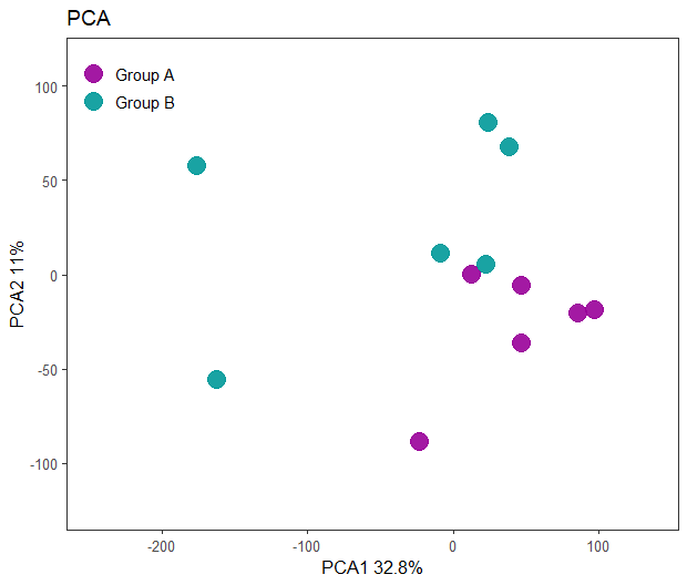
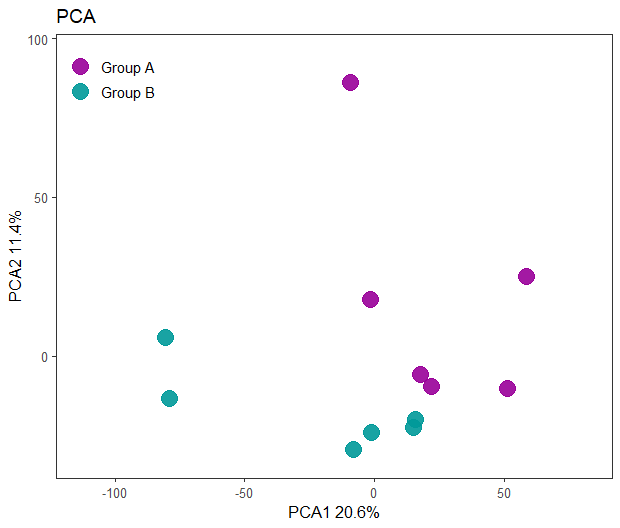
As shown below, we achieve better separation between the plots using the log-transformed data. This is expected, as gene expression data typically follows a log-normal distribution, while PCA assumes a normal distribution. By applying a log transformation, we align the data more closely with the assumptions of PCA, improving the analysis.
PCA plot scaled data

PCA plot Log transformed data

3D plots
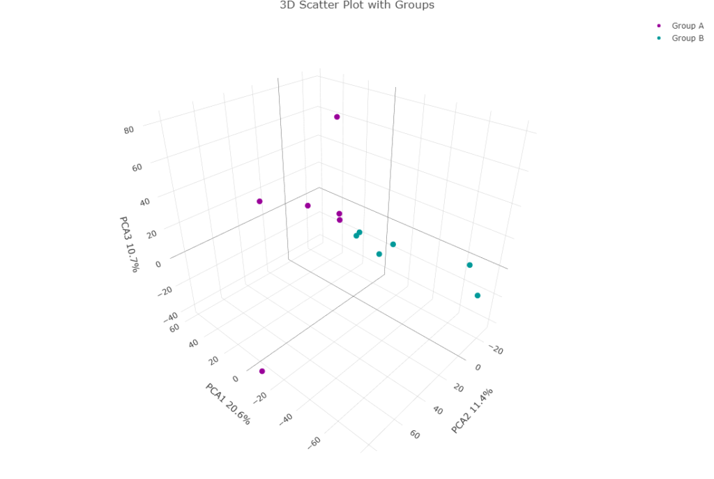
3D plots can incorporate the PC3 component into the visualization. While conceptually this can be important in certain cases, in practice, I have rarely found it necessary. An example of a 3D plot being interesting is, imagine an experiment with diseased and healthy animals, placebo and treated groups, and two sexes. It’s plausible that the disease state has the most significant effect on gene expression, which would drive the separation of animals into diseased and healthy groups along PCA1. The drug may affect gene expression without altering the disease state, which would be captured on the orthogonal PCA2 axis. Finally, sex might have a smaller, yet measurable, effect on gene expression that is independent of disease and treatment, which would align with PCA3. This is how you could visualize all three components simultaneously.
# Load the 'plotly' library for interactive plotting
if (!require(plotly)) {install.packages("plotly")}
library(plot_ly)

# Create a 3D scatter plot with PCA data
p <- plot_ly(
  x = PCA$x[, 1],  # First principal component (PCA1) as the x-axis
  y = PCA$x[, 2],  # Second principal component (PCA2) as the y-axis
  z = PCA$x[, 3],  # Third principal component (PCA3) as the z-axis
  type = "scatter3d",  # Specify a 3D scatter plot type
  mode = "markers",    # Use markers to represent data points
  color = ~group,      # Color the points based on the 'group' variable
  colors = custom_colors,  # Define custom colors for the groups
  marker = list(size = 5)  # Set the size of the markers (points)
)

# Modify the layout of the plot to include axis labels and title
p <- p %>%
  layout(
    title = "3D Scatter Plot with Groups",  # Set the title of the plot
    scene = list(
      xaxis = list(title = paste0("PCA1 ", (100 * summary_PCA$PC1[2]), "%")),  # Label x-axis with PCA1 and its explained variance
      yaxis = list(title = paste0("PCA2 ", (100 * summary_PCA$PC2[2]), "%")),  # Label y-axis with PCA2 and its explained variance
      zaxis = list(title = paste0("PCA3 ", (100 * summary_PCA$PC3[2]), "%"))   # Label z-axis with PCA3 and its explained variance
    )
  )

# Display the plot
p
Hopefully you can see that PCA3 isn’t doing anything here. This is typically what I see. But I’m sure that in some cases it is important. So it is often worth a check.
