A complete guide to ANOVAs in R
This again is more for my use than anyone else’s. The focus of this post is doing ANOVAs (or linear models, after all everything is a linear model), in a nice readable and publishable way with transformations, post-hocs and graphs. Mostly for appearance reasons, this processes uses lots of packages. Packages should normally be avoided, but one thing they’re good at is making things pretty. So that’s what they’re used for here.
Install packages
Note for this I’ve put this if(!require) function in. This means it won’t install the package if it doesn’t need to. This method just saves time and allows you to run all your code without the delays of reinstalling packages.
if(!require(MASS)) install.packages("MASS")
if(!require(sjPlot)) install.packages("sjPlot")
if(!require(ggplot2)) install.packages("ggplot2")
if(!require(emmeans)) install.packages("emmeans")
if(!require(viridis)) install.packages("viridis")
if (!require("remotes")) install.packages("remotes")
remotes::install_github('sinhrks/ggfortify')

library(ggplot2); library(sjPlot); library(ggfortify); library(MASS); library(emmeans);
Load the data
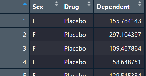
Here we are just loading the example data set and having a look. The data has two explanatory variables, Sex and Drug, with one dependent variable. So we could imagine this study is testing the response to a drug or placebo in male and females just to see if sex effects how individuals respond to a drug. This is a classic two-way ANOVA design. Two factors -> Sex and Drug.
ANOVA_example<-read.table(url("https://jackauty.com/wp-content/uploads/2022/11/ANOVA_example2.txt"), header =T)
View(ANOVA_example)
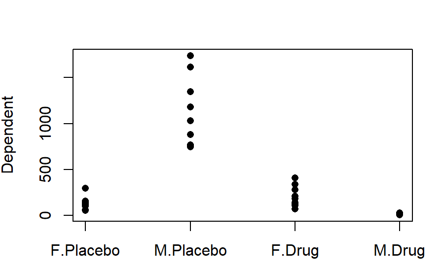
Quick graph
I would always recommend doing a quick and ugly graph just to orientate yourself with the data.
stripchart(Dependent~Sex*Drug, data=ANOVA_example, pch=16, vertical =T)
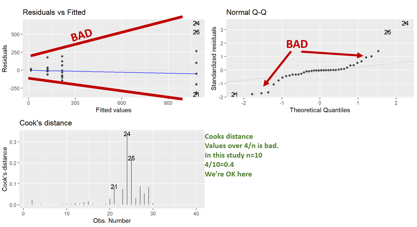
Run the base ANOVA
Here we are running the base ANOVA (linear model) and then checking the assumptions. It’s good to check the assumptions before seeing if you have any significance. That way you aren’t tempted to go “hey it’s significant, let’s not do any transformations”.
What we can see in the diagnostic plots is that a transformation is needed.
The top left plot is residuals vs fitted, this tests for homoscedasticity, what we want is an even scattering of data, what we see is the data gets more variable as the fitted values increase. i.e. the variation increases as the mean increases.
Next in the top right we have a Q-Q plot. This plots the residuals vs a theoretical normal distribution (dotted line). The dots should be on the line. We can see the residuals are not normally distributed as they depart from the dotted line at the extremes.
Lastly, we have Cooks distance. This is a measure of data with extreme influence and effect on the model (aka outliers). Now the rule of thumb is you don’t want a Cook’s distance of more than 4/n. This study has n=10, so more than 0.4 is bad. However, there’s nothing you can do in experimental biology with outliers. The only thing would be to go back and look at your lab book. You cannot just remove data you don’t like, but, if you go back and your lab book says “I think I gave the wrong drug to this individual”, or something, THEN you have grounds to remove it.
Note: Using ggfortify’s autoplot function makes them look nice and automatically lays them out in a grid (no need for par(mfrow=c(2,2)), like in base r).
#Running base ANOVA
aov_base<-lm(Dependent~Sex*Drug, data=ANOVA_example)

 #Diagnostic plots
autoplot(aov_base,which = c(1,2,4))
BoxCox transformation
So you can just have a guess at a transformation needed. The wedge shaped residual vs fitted plot above tells us we need a shrinking transformation like a LOG10 or square root. However, if we can take the researcher out of the process this is better. What if the LOG10 and square root have similar diagnostic plots, but the LOG10 gives you significant results and the square root transformation gives you p=0.051. You might be tempted to choose the LOG10 transformation because it gives you significance.
What we can do is a BoxCox transformation. This is an automated process that transforms your data by a range of powers and evaluates the normality of the residuals. Then it chooses the power (Selected.lamda) that produces the most normally distributed residuals. Typically, when you solve normality, you also solve homoscedasticity.
 #BoxCox transformation
boxcox<-boxcox(aov_base,lambda = seq(-5, 5, 1/1000), plotit = TRUE )

Selected.lambda <-boxcox$x[boxcox$y==max(boxcox$y)]
Selected.lambda

#Run the transformed model
aov_base_trans<-lm(Dependent^Selected.lambda ~Sex*Drug, data=ANOVA_example)
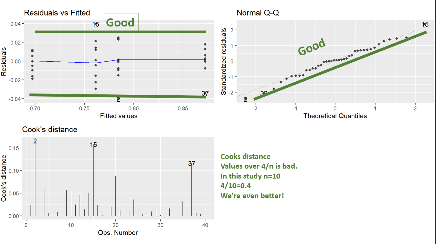
Assumption checking the transformed model
And we can see running the diagnostic plots, the BoxCox transformation has totally worked. Those look perfect.
 #Diagnostic plots autoplot
autoplot(aov_base_trans, which = c(1,2,4))
Looking at your final model
Using the tab_model function from sjPlot makes your summary tables pretty. This is looking at your analysis like a linear model, so it gives you the coefficients. This is nice, because it allows you to see the magnitude and direction of the effects (ANOVA summaries do not). So we can see everything is significant. But the large positive coefficient of the interaction term tells us that males respond to the drug more than females. Note estimate direction is a little difficult because of the transformation. Because it’s a negative lambda we actually have to flip the estimates direction, so the positive coefficient for the interaction term tells us that Males have a large decrease in response to the drug.
 #Summary of the linear model gives you the coefficients
tab_model(aov_base_trans)
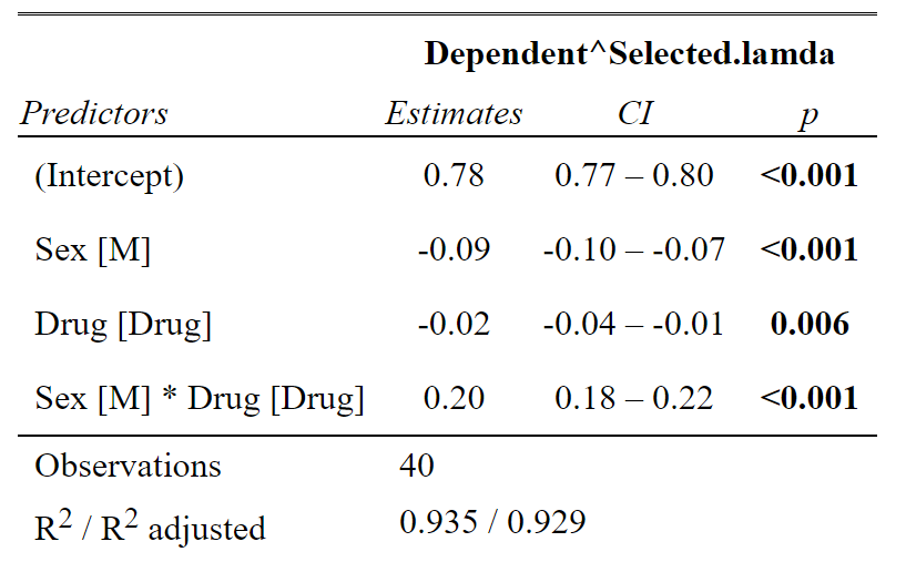
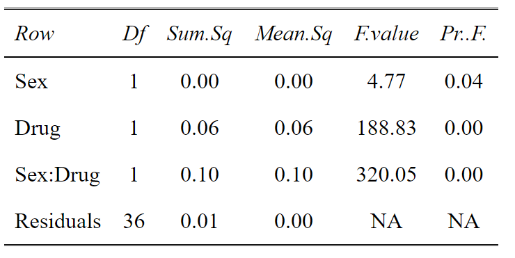
However, sometimes you might have many levels within a factor. For example you could have low dose, medium dose and high dose of a drug and you don’t want to see the effects of each level, you want to know does the drug overall have an effect (explain variation in the data). For this an ANOVA table is more useful. From this we can see there is a significant main effect of Sex, a significant main effect of Drug and a significant interaction between the two. Again using tab_df from sjPlot makes the table look pretty.
 #ANOVA of the linear model
tab_df(anova(aov_base_trans),show.rownames =T)
Post hoc analysis
OK this is a Post-hoc analysis with a priori selected comparisons. We don’t want to do all the comparisons, because some are useless. Why compare Females on Drug with Males on Placebo? That doesn’t make sense. So in this, we select our comparisons and adjust for only those comparisons.
#Posthoc/Planned contrasts
post <- lsmeans(aov_base_trans, pairwise ~ Sex*Drug, adjust="none")

posthoc<-summary(post)

tab_df(posthoc$contrasts[,c(1,4)],show.rownames =T)
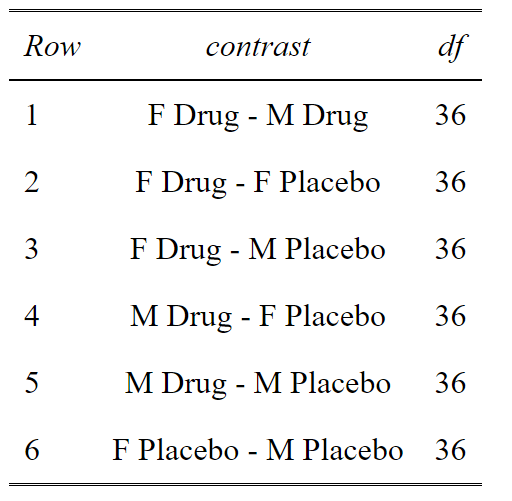
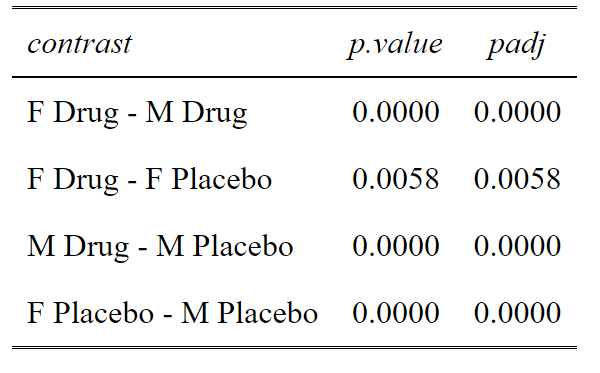
This code gives us a list of potential comparisons. We then select the one’s we want. In this case 1, 2, 5 and 6. We can see that comparisons of Male Drug vs Female Placebo and Male Placebo vs Female Drug, really do not make any biological sense to compare. So we don’t want to do these needless comparisons that cost us statistical power.
#Build a dataframe of all the comparisons (contrasts) and the unadjusted p values
p.value<-data.frame(cbind(posthoc$contrasts["contrast"],posthoc$contrasts["p.value"]))

#Select the comparison you are interested in
comparisons<-c(1,2,5,6)
ptable<-p.value[comparisons,]

#Create a column of adjusted p values using the Holm-Sidak method
ptable$padj<-p.adjust(ptable$p.value, method="holm")

#View the table in a pretty way
tab_df(ptable,digits = 4)
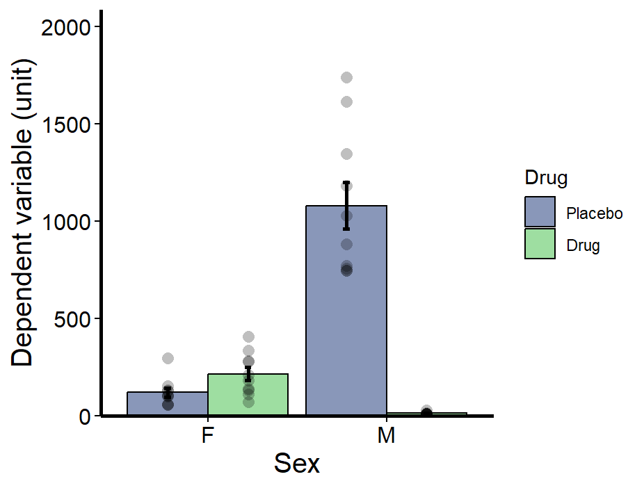
Graphing your results
Now the first thing we need to do is manipulate our data a little. R will automatically work alphabetically and so Drug will be first (left side) on the graph, then Placebo. By convention, Placebo and Controls are always first (left). We also need to make a single column that explains what groups all the data belong to. So here’s the code for this data manipulation.
#Editing the variables to work with the graphs
##Making Drug a factor
ANOVA_example$Drug<-as.factor(ANOVA_example$Drug)
##Reorder the factor so Placebo is first
ANOVA_example$Drug<-factor(ANOVA_example$Drug, levels = c("Placebo", "Drug"))

##Making a grouping column that describes the data
ANOVA_example$Group<-as.factor(paste(ANOVA_example$Sex,ANOVA_example$Drug, sep= " "))

##Reording the factors to make sense
ANOVA_example$Group<-factor(ANOVA_example$Group, levels = levels(ANOVA_example$Group)[c(2,1,4,3)])

ANOVA_example$Drug<-as.factor(ANOVA_example$Drug)
ANOVA_example$Drug<-factor(ANOVA_example$Drug, levels = levels(ANOVA_example$Drug)[c(2,1)])
Making the graph
So here is all the finicky details for making the graph. I like showing the points. I think it’s important to have the raw data there. Also, it’s important to use the scale_fill_viridis_d function as this makes it colour blind friendly.
Bar_plot <- ggplot(ANOVA_example, aes(Sex, Dependent, fill = Drug))+
#Make bars using the mean
geom_bar(position = 'dodge', stat = 'summary', fun = 'mean', alpha=0.6, colour=1) +

#Make error bars using SEM
geom_errorbar(stat = 'summary',fun.data= "mean_se", position=position_dodge(.9), width = 0.075, colour=1, size=1) +

#Add data points
geom_point(aes(group = Group), shape = 21, position = position_dodge(0.9), alpha= 0.25, stroke = NA, size=3, fill =1)+

#Remove background colour and gridlines
theme_classic()+

#Ensure axes join at 0,0 and set the y axis limits
scale_y_continuous(expand = c(0, 0), limits = c(0,1.2*max(ANOVA_example$Dependent)))+

#Make axis lines thicker
theme(axis.line = element_line(size=1)) +

#Label Axis
labs(x = "Sex", y="Dependent variable (unit)")+

#Make axis lines thicker
theme(axis.line = element_line(size=1)) +

#Adjust axis font sizes and font colour
theme(axis.title = element_text(size = 15), axis.text.x = element_text(size=12, color="black"),          axis.text.y = element_text(size=12, color="black")) +

#Make ticks black
theme(axis.ticks=element_line(color="black", lineend = "square")) +

#Fill viridis
scale_fill_viridis_d(begin=0.25, end=0.75, alpha=0.5)

#View plot
Bar_plot
Saving the graph
Now I like to save as a PDF. This is a vector image which can be opened in illustrator. High res images can be taken of the PDF by zooming in a taking a snapshot (it sounds crazy but it works). Also, the pdf function works with everything, R basic, Plotly, ggplot2 -> everything. So it’s easy.
#Save as PDF
pdf("example.pdf", height=4, width=4.5)
Bar_plot
dev.off()
Reference list
The last thing I like to do is make a nice reference list. This can be finicky with GitHub packages. But it’s easy with CRAN packages.
#Making a reference list
pkg <- c("MASS","sjPlot","ggplot2","emmeans","ggfortify")

#Create a loop to build a dataframe of the references
citation_list<-factor()

for(i in pkg){   citation_list<- c(citation_list,paste(capture.output(print(citation(i), style ="text",bibtext=F)), collapse="\n")) }

#Display the dataframe nicely with sjPlot's tab_df
tab_df(   data.frame(citation_list), col.header="References", sep=" ")
The full code all in one
Just if you want an easy to copy and paste full code set. Here you go.
if(!require(MASS)) install.packages("MASS")
if(!require(sjPlot)) install.packages("sjPlot")
if(!require(ggplot2)) install.packages("ggplot2")
if(!require(emmeans)) install.packages("emmeans")
if(!require(ggplot2)) install.packages("ggplot2")
if (!require("remotes")) install.packages("remotes")
remotes::install_github('sinhrks/ggfortify')


library(ggplot2); library(sjPlot); library(ggfortify); library(MASS); library(emmeans);

ANOVA_example<-read.table(url("https://jackauty.com/wp-content/uploads/2022/11/ANOVA_example2.txt"), header =T)

View(ANOVA_example)

stripchart(Dependent~Sex*Drug, data=ANOVA_example, pch=16, vertical =T)

#Running base ANOVA
aov_base<-lm(Dependent~Sex*Drug, data=ANOVA_example)

#Diagnostic plots
autoplot(aov_base,which = c(1,2,4))

#BoxCox transformation
boxcox<-boxcox(aov_base,lambda = seq(-5, 5, 1/1000), plotit = TRUE )

Selected.lambda <-boxcox$x[boxcox$y==max(boxcox$y)]
Selected.lambda


#Run the transformed model
aov_base_trans<-lm(Dependent^Selected.lambda ~Sex*Drug, data=ANOVA_example)


#Diagnostic plots autoplot
autoplot(aov_base_trans, which = c(1,2,4))

#Summary of the linear model gives you the coefficients
tab_model(aov_base_trans)

#ANOVA of the linear model
tab_df(anova(aov_base_trans),show.rownames =T)

#Posthoc/Planned contrasts
post <- lsmeans(aov_base_trans, pairwise ~ Sex*Drug, adjust="none")
posthoc<-summary(post)

tab_df(posthoc$contrasts[,c(1,4)],show.rownames =T)

#Build a dataframe of all the comparisons (contrasts) and the unadjusted p values
p.value<-data.frame(cbind(posthoc$contrasts["contrast"],posthoc$contrasts["p.value"]))

#Select the comparison you are interested in
comparisons<-c(1,2,5,6)
ptable<-p.value[comparisons,]

#Create a column of adjusted p values using the Holm-Sidak method
ptable$padj<-p.adjust(ptable$p.value, method="holm")

#View the table in a pretty way
tab_df(ptable,digits = 4)

##Making a grouping column that describes the data
ANOVA_example$Group<-as.factor(paste(ANOVA_example$Sex,ANOVA_example$Drug, sep= " "))

##Reording the factors to make sense
ANOVA_example$Group<-factor(ANOVA_example$Group, levels = levels(ANOVA_example$Group)[c(2,1,4,3)])
ANOVA_example$Drug<-as.factor(ANOVA_example$Drug)
ANOVA_example$Drug<-factor(ANOVA_example$Drug, levels = levels(ANOVA_example$Drug)[c(2,1)])


bar_plot <- ggplot(ANOVA_example, aes(Sex, Dependent, fill = Drug))+
  #Make bars using the mean
  geom_bar(position = 'dodge', stat = 'summary', fun = 'mean', alpha=0.6, colour=1) +

  #Make error bars using SEM
  geom_errorbar(stat = 'summary',fun.data= "mean_se", position=position_dodge(.9), width = 0.075, colour=1, size=1) +

  #Add data points
  geom_point(aes(group = Group), shape = 21, position = position_dodge(0.9), alpha= 0.25, stroke = NA, size=3, fill =1)+

  #Remove background colour and gridlines
  theme_classic()+

  #Ensure axes join at 0,0 and set the y axis limits
  scale_y_continuous(expand = c(0, 0), limits = c(0,1.2*max(ANOVA_example$Dependent)))+

  #Make axis lines thicker   theme(axis.line = element_line(size=1)) +

  #Label Axis   labs(x = "Sex", y="Dependent variable (unit)")+

  #Make axis lines thicker
  theme(axis.line = element_line(size=1)) +

  #Adjust axis font sizes and font colour
  theme(axis.title = element_text(size = 15), axis.text.x = element_text(size=12, color="black"),          axis.text.y = element_text(size=12, color="black")) +

  #Make ticks black
  theme(axis.ticks=element_line(color="black", lineend = "square")) +

  #Fill viridis
  scale_fill_viridis_d(begin=0.25, end=0.75, alpha=0.5)

#View plot
bar_plot

#Save as PDF
pdf("example22.pdf", height=4, width=4.5)
bar_plot
dev.off()


#Making a reference list
pkg <- c("MASS","sjPlot","ggplot2","emmeans","ggfortify")

#Create a loop to build a dataframe of the references
citation_list<-factor()

for(i in pkg){   citation_list<- c(citation_list,paste(capture.output(print(citation(i), style ="text",bibtext=F)), collapse="\n")) }

#Display the dataframe nicely with sjPlot's tab_df
tab_df(   data.frame(citation_list), col.header="References", sep=" ")