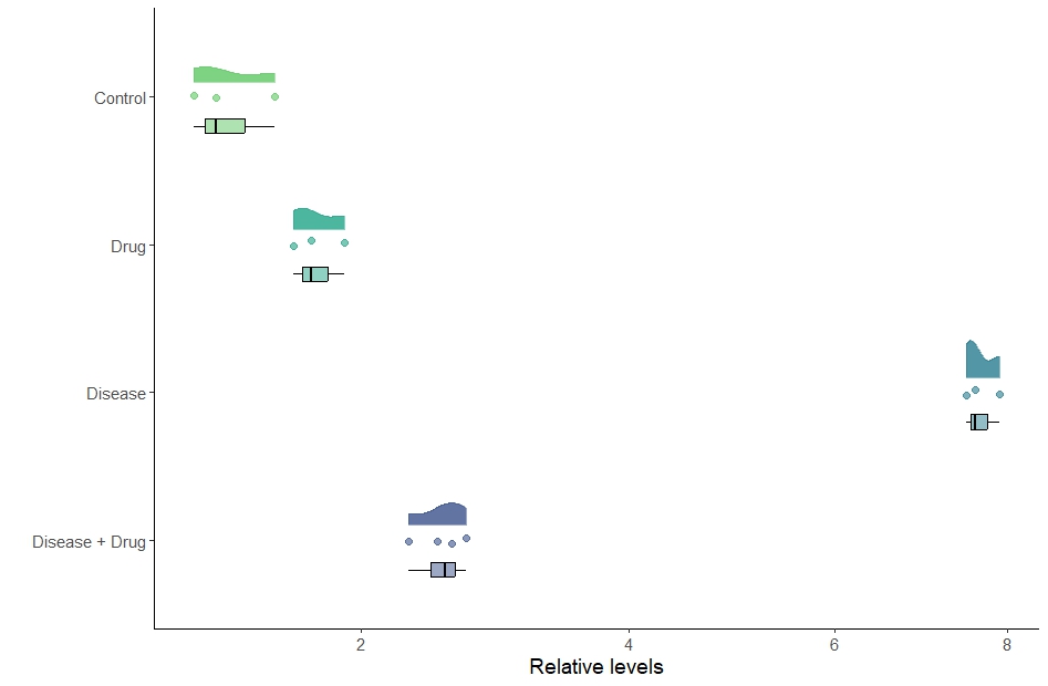
How to make a Rain Cloud Plot (aka a Rotated Violin plot)
These are great plots. They look good and do not hide any information. They provide quick insights into the data, including its spread, any differences present, and the rough distributions. It is important to choose a graph that matches the statistical test conducted. For instance, if you show mean +/- SEM or SD, you should have performed a parametric test, like an ANOVA. On the other hand, if you display medians and quartiles (box plot), you should have used a non-parametric test, like a Mann-Whitney test. However, the Rain Cloud plot displays all the necessary information, making it suitable for any type of statistical test. In general, these plots are great. However, their main limitation is that they really only work with a sufficiently large sample size (N). If you have an N of less than 8 in each group, it is advisable to skip the distribution part of the graph. Below is the code.
#Load the packages
install.packages("PupillometryR")
install.packages("ggplot2")
library("PupillometryR")
library("ggplot2")


#Load the data
example<- read.table(url("https://jackauty.com/wp-content/uploads/2021/02/barchart3.txt"), header=T)


#Editing the variables to work with the graphs
##Making Treatment a factor
example$Treatment<-as.factor(example$Treatment)

# Generating a color palette named "colours" with four colors from the "viridis" palette
colours <- viridis(4, begin = 0.25, end = 0.75, alpha = 0.5)

#Reording the factors to make sense (from bottom to top)
example$Treatment<-factor(example$Treatment, levels = c("Disease_Drug","Disease","Drug","Control"))

# Creating a ggplot object called "rain_cloud_plot" using the data frame "example"

rain_cloud_plot <- ggplot(example, aes(Treatment, Dependent_Variable, fill = Treatment, col = Treatment)) +

# Adding a flat violin plot with some horizontal position adjustment and transparency
  geom_flat_violin(position = position_nudge(x = 0.1, y = 0), alpha = 0.8, width = 0.5) +

# Adding points to the plot with jittering and dodging for better visualization, along with some transparency
  geom_point(position = position_jitterdodge(dodge.width = 0.15, jitter.width = 0.15), size = 2, alpha = 0.6) +

# Adding a box plot with black color, no outliers, some transparency, and horizontal position adjustment
  geom_boxplot(color = "black", width = 0.1, outlier.shape = NA, alpha = 0.5, position = position_nudge(x = -0.2, y = 0)) +

# Flipping the x and y axes (transposing) to create a horizontal plot
  coord_flip() +

# Setting the x and y axis labels and adjusting the y-axis scale to a square root transformation
  labs(x = "", y = "Relative levels") +
  scale_y_continuous(trans = "sqrt") +

# Applying a classic theme to the plot
  theme_classic() +

# Removing the legend from the plot
  theme(legend.position = "none") +

# Adjusting the font size for the text elements in the plot
  theme(text = element_text(size = 14)) +

# Setting the color palette for the fill aesthetic
  scale_fill_manual(values = colours) +

# Setting the color palette for the color aesthetic
  scale_colour_manual(values = colours)+
# Relabel x axis
  scale_x_discrete(labels=c("Disease + Drug", "Disease","Drug", "Control"))

# Displaying the plot
rain_cloud_plot