How to make a simple bar graph in R
OK, I’ll be honest, this post is mostly for me. I always forget how to do all of this and end up spending hours on google. So now I can do what all coders do, copy – paste – adjust.
So here we go -> how to do a simple bar chart with SEMs, that looks publication quality.
I feel like the blog is a little like this meme…. sorry.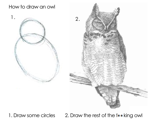
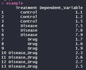
Load the data and look at it to understand it and make sure it makes sense. This data is very simple
#Obviously you'll need ggplot2
library(ggplot2)
#Load and look at the data
example<- read.table(url("https://jackauty.com/wp-content/uploads/2021/02/barchart3.txt"), header=T)
example
 ##Reording the factors to make sense
example$Treatment<-as.factor(example$Treatment)
example$Treatment<-factor(example$Treatment, levels = levels(example$Treatment)[c(1,4,2,3)])
#Create the plot and do all the annoying adjustments (draw the rest of the owl lol)
bar_plot <- ggplot(example, aes(Treatment, Dependent_Variable, fill = Treatment))+
#Make bars using the mean
geom_bar(position = 'dodge', stat = 'summary', fun = 'mean', alpha=0.6, colour=1) +
#Make error bars using SEM
geom_errorbar(stat = 'summary',fun.data= "mean_se", position=position_dodge(.9), width = 0.075, colour=1, size=1) +
#Add data points
geom_point( shape = 21, position = position_dodge(0.9), alpha= 0.25, stroke = NA, size=3, fill =1)+
#Remove background colour and gridlines
theme_classic()+
#Ensure axes join at 0,0 and set the y axis limits
scale_y_continuous(expand = c(0, 0), limits = c(0,1.2*max(example$Dependent_Variable)))+
# Relabel x axis
scale_x_discrete(labels=c("Control","Drug", "Disease", "Disease + Drug"))+
#Make axis lines thicker
theme(axis.line = element_line(linewidth=1)) +
#Label Axis
labs(x = "", y="Dependent variable (unit)")+
#Make axis lines thicker
theme(axis.line = element_line(size=1)) +
#Adjust axis font sizes and font colour
theme(axis.title = element_text(size = 15), axis.text.x = element_text(size=12, color="black"),
axis.text.y = element_text(size=12, color="black")) +
#Make ticks black
theme(axis.ticks=element_line(color="black", lineend = "square")) +
#Fill viridis
scale_fill_viridis_d(begin=0.25, end=0.75, alpha=0.5) +
#Remove legend
theme(legend.position = "none")
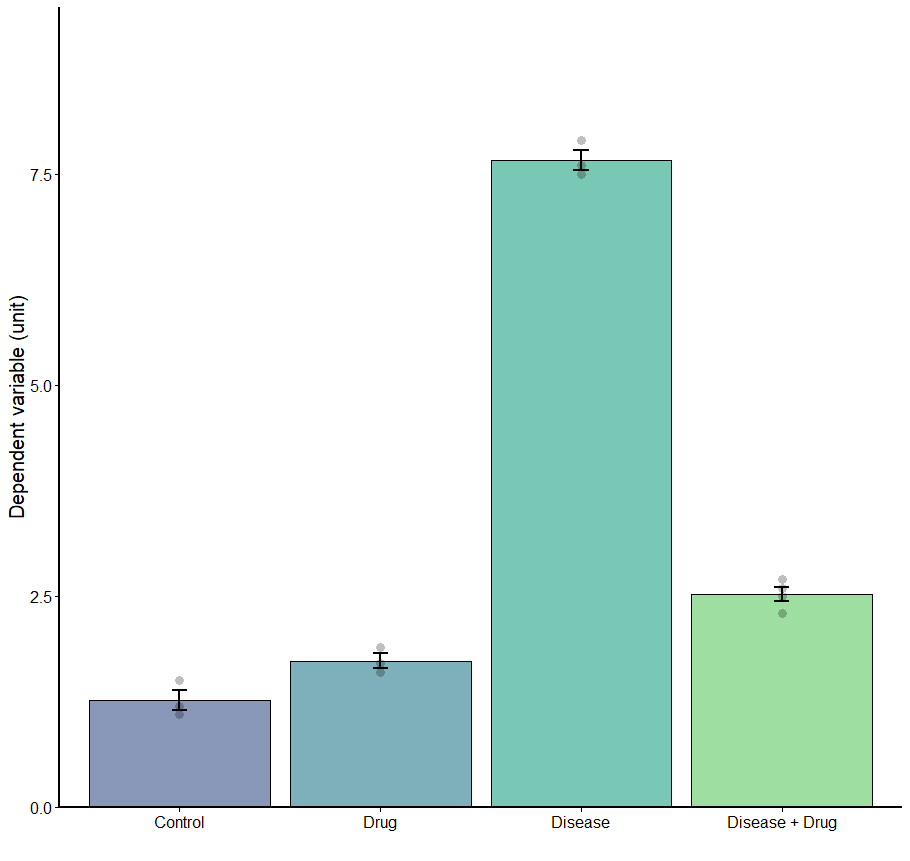
#View plot
bar_plot
#View plot
bar_plot
##Reording the factors to make sense
example$Treatment<-as.factor(example$Treatment)
example$Treatment<-factor(example$Treatment, levels = levels(example$Treatment)[c(1,4,2,3)])
#Create the plot and do all the annoying adjustments (draw the rest of the owl lol)
bar_plot <- ggplot(example, aes(Treatment, Dependent_Variable, fill = Treatment))+
#Make bars using the mean
geom_bar(position = 'dodge', stat = 'summary', fun = 'mean', alpha=0.6, colour=1) +
#Make error bars using SEM
geom_errorbar(stat = 'summary',fun.data= "mean_se", position=position_dodge(.9), width = 0.075, colour=1, size=1) +
#Add data points
geom_point( shape = 21, position = position_dodge(0.9), alpha= 0.25, stroke = NA, size=3, fill =1)+
#Remove background colour and gridlines
theme_classic()+
#Ensure axes join at 0,0 and set the y axis limits
scale_y_continuous(expand = c(0, 0), limits = c(0,1.2*max(example$Dependent_Variable)))+
# Relabel x axis
scale_x_discrete(labels=c("Control","Drug", "Disease", "Disease + Drug"))+
#Make axis lines thicker
theme(axis.line = element_line(linewidth=1)) +
#Label Axis
labs(x = "", y="Dependent variable (unit)")+
#Make axis lines thicker
theme(axis.line = element_line(size=1)) +
#Adjust axis font sizes and font colour
theme(axis.title = element_text(size = 15), axis.text.x = element_text(size=12, color="black"),
axis.text.y = element_text(size=12, color="black")) +
#Make ticks black
theme(axis.ticks=element_line(color="black", lineend = "square")) +
#Fill viridis
scale_fill_viridis_d(begin=0.25, end=0.75, alpha=0.5) +
#Remove legend
theme(legend.position = "none")
#View plot
bar_plot
#View plot
bar_plotOutput it as a PDF
#PDF Plot
ggsave("SuperCoolBarchart.pdf", device="pdf")
AND HERE IT IS…… MY GOSH IT’S…. boring but publishable.
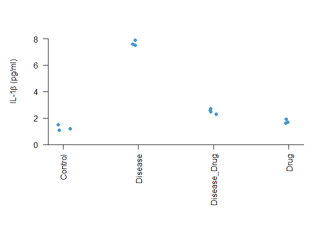
Bonus stripchart fun!
This is great for a very quick plot that looks OK
#Create plot
par(mar = c(9, 5, 2, 2),bty = 'n')
stripchart(example$Dependent_Variable~example$Treatment, vertical = T, pch=16,
 method="jitter", las=2, col="#4299D0",ylim=c(0, 1.2*max(example$Dependent_Variable)),
 xaxs = "i",yaxs = "i", ylab=expression(paste("IL-1", beta, " (pg/ml)")))
abline(0,0)

#Also in here is how to put beta (β) into your graph
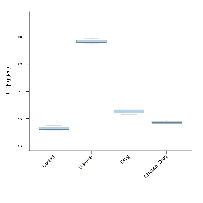
Bonus boxplot fun!
This is great for a very quick plot that looks OK
#Export as pdf
pdf("boxplot.pdf")

#Increase margins
par(mar = c(9, 5, 2, 2),bty = 'n')

#Set up text labels
labs<-as.character(unique(example$Treatment))

#Make plot
boxplot(example$Dependent_Variable~example$Treatment,xlab=""
 , las=2, col="#4299D066",ylim=c(0, 1.2*max(example$Dependent_Variable)), axes=F,
 , ylab=expression(paste("IL-1", beta, " (pg/ml)")))

#Add axis markers, labels and lines
axis(side = 1,at=c(1:length(labs)), labels = c(rep("", length(labs))))
text(cex=1, x=c(1:length(labs)), y=-0.75, labs, xpd=TRUE, srt=45, adj=1)
axis(side = 2)
box(bty="l", lwd=2)

#Turn off PDF device
dev.off()

#Also in here is how to put beta (β) into your graph
#Also in here is how to export as a PDF and how to rotate your labels 45 degrees